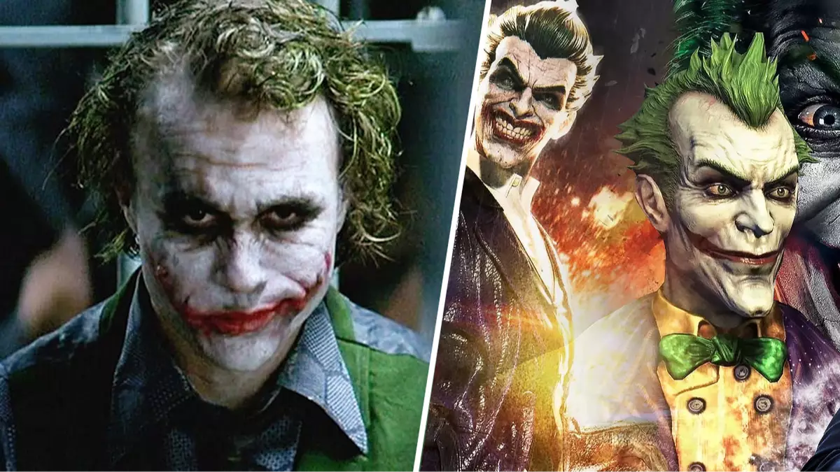
Don’t worry folks, we’re not getting a sequel to Joker: Folie à Deux, but we are getting maybe the single coolest-looking Joker design in the history of DC Comics.
Batman Ninja is a 2018 anime-inspired take on Batman and his rogues gallery. The film received generally great reviews, due in part to the incredible work that Afro Samurai creator Takashi Okazaki did for its character designs.
The currently unreleased sequel to Batman Ninja, Batman Ninja vs. Yakuza League, just got a new poster featuring The Joker and Harley Quinn, and the new design has somehow attracted universal praise. Turns out people on the internet can agree on stuff. Who knew?
Advert
The Joker in Batman Ninja, much like all the other redesigns in the film, was supposed to take inspiration from Feudal Japan, and it absolutely worked. It should have been a tough act to follow, and yet they’ve managed to knock it out of the park a second time.
The Joker in Batman Ninja vs. Yakuza League, as the title might imply, is supposed to look like a stereotypical, greaser-style hoodlum. Think of a ruffian in an anime with a pompadour-style hairdo, like Kuwabara in YuYu Hakusho, and you’re already halfway there.
For some reason though, it just works for The Joker. The overly tough persona and the loud, ridiculous outfit just go hand-in-hand with his character. Harley squatting next to him with a spiked bat also just really brings the whole look together.
A teaser trailer for Batman Ninja vs. Yakuza League, featuring the new redesigns for Wonder Woman, The Flash, and Aquaman dropped a few months back, but as of now we don’t have any concrete date for its release.
If it’s half as good as the new poster implies, I reckon it’ll be more than worth the wait.
Featured Image Credit: Warner Bros.
Topics: Batman, DC, Warner Bros
Batman fans can rarely seem to agree on anything, but Joker’s new redesign in Batman Ninja vs. Yakuza League seems to have brought everyone together Read More

